Barbaros Barbers Davos is a premium landing page that blends traditional craftsmanship with a modern, dark-themed experience to build brand authority and drive bookings.
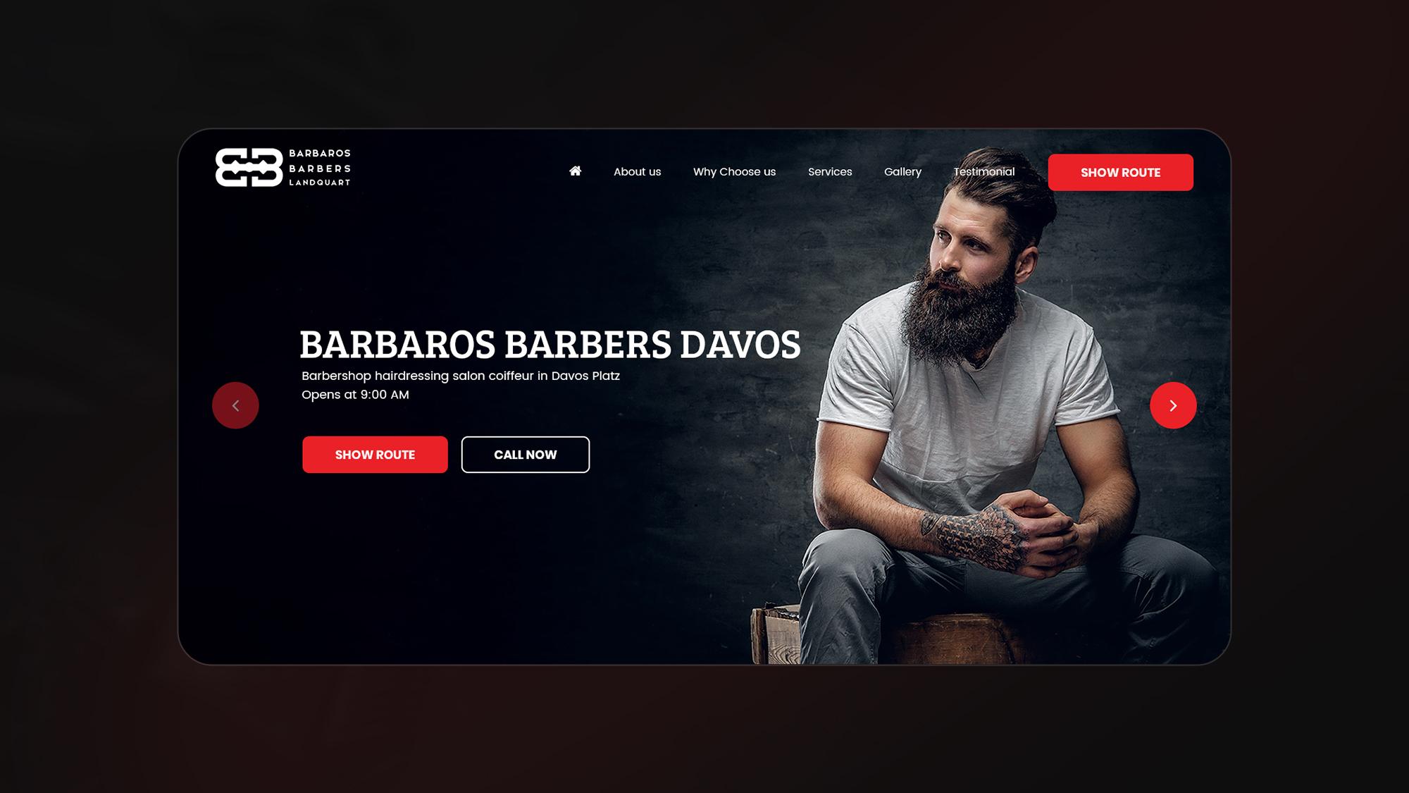
Create a high-end digital experience that showcases services and craftsmanship without overwhelming users or losing the brand's rugged yet refined identity.
Designed a sleek dark UI with strong hierarchy, impactful imagery, and clear CTAs to guide users smoothly from exploration to booking.
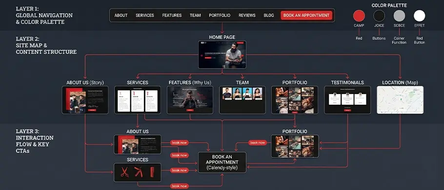
User flow visualization showing the primary path from onboarding to core task completion, ensuring minimal friction and logical hierarchy.
Primary / Playfair Display , Montserrat
Abc
Heading 1
Bold 32pt
Body Copy
Regular 16pt / Line-height 1.6
#E61E25
#0B0B0B
#C0C0C0
A curated selection of high-resolution images showcasing the shop's work.
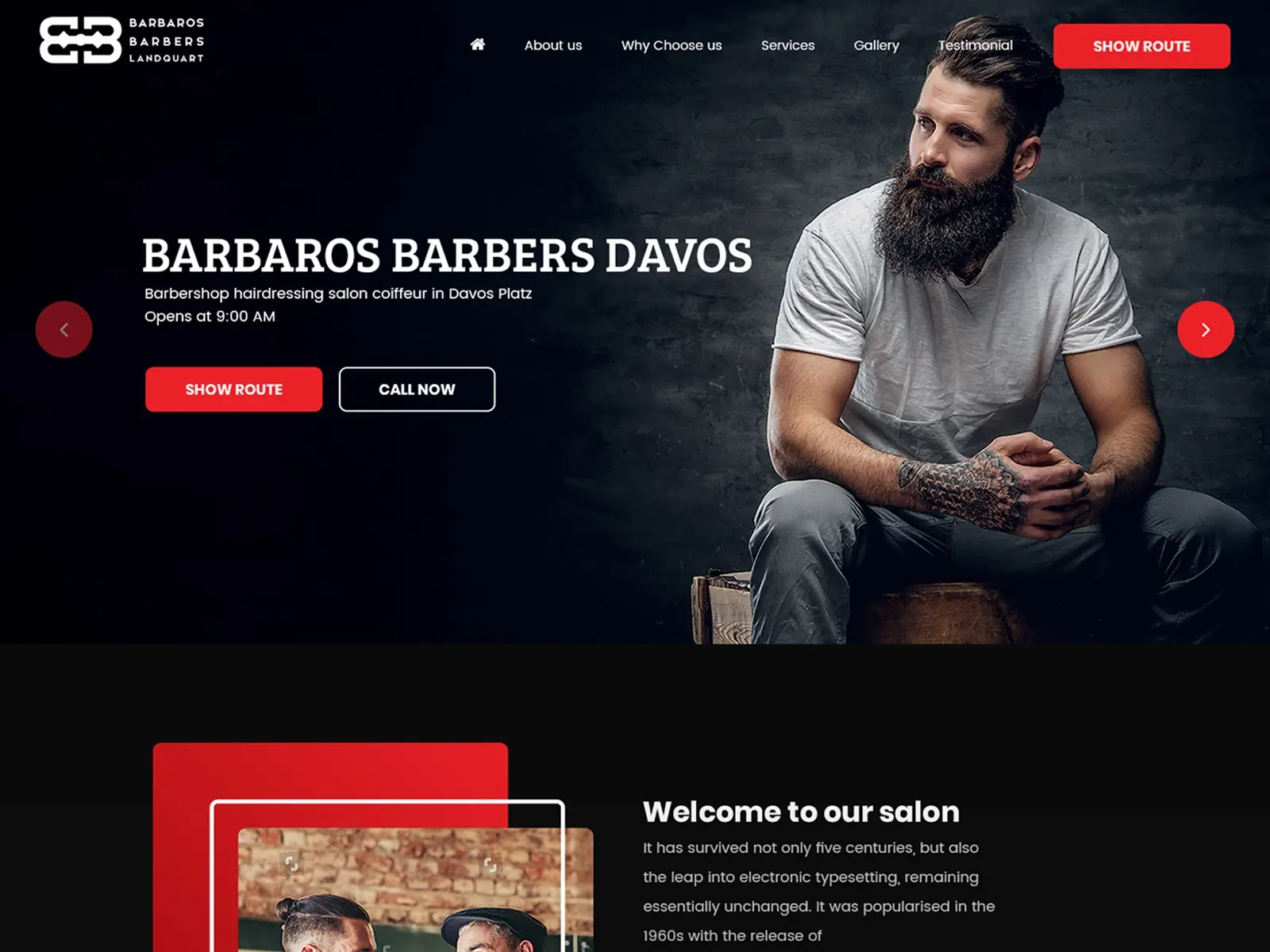
High-contrast red Book Now buttons placed at the top and bottom of the page.
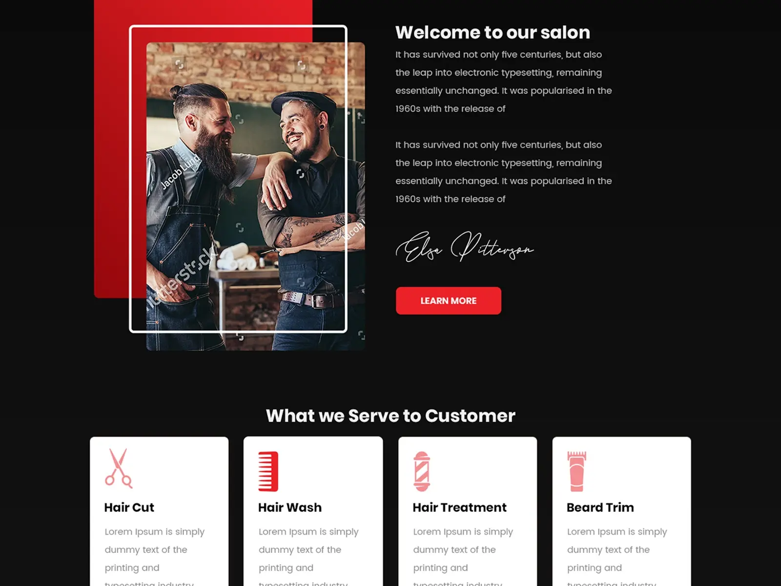
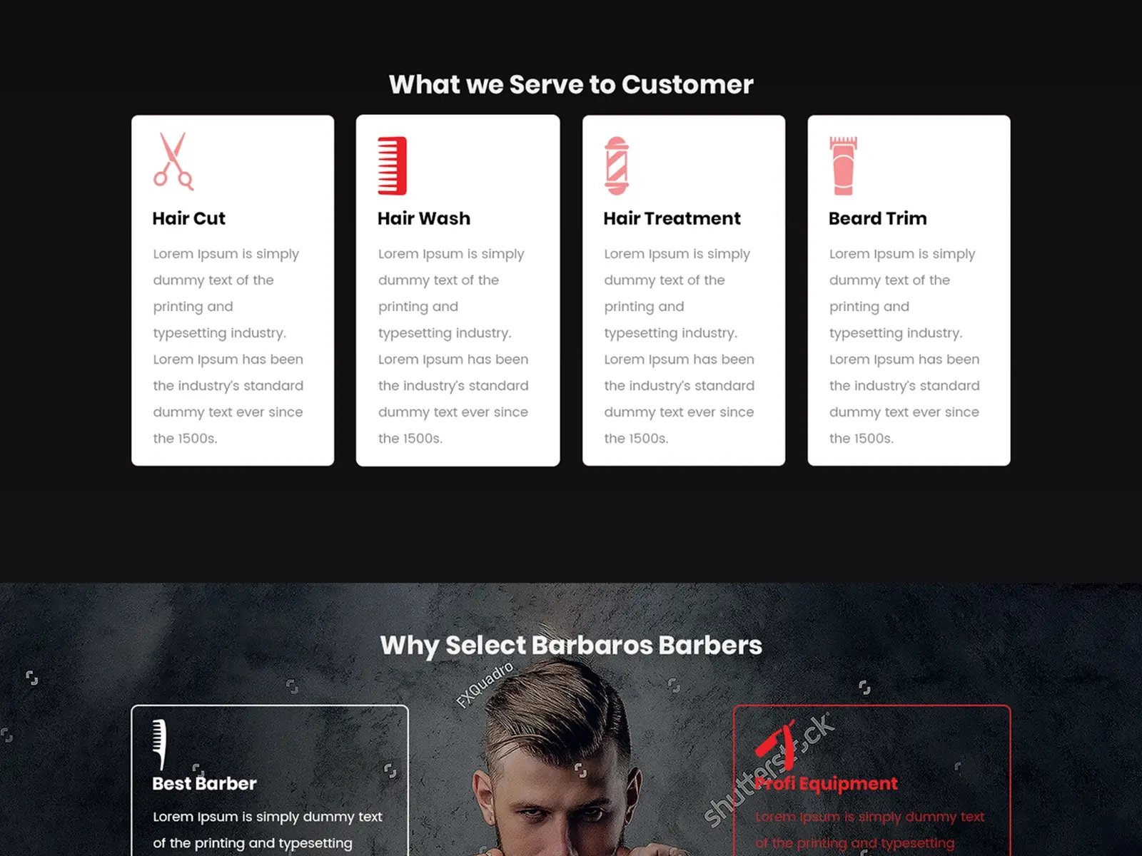
Icon-based cards explaining specific grooming services.
Experience the flow firsthand through this interactive prototype focusing on micro-interactions and seamless transitions.
learned that in dark-themed designs, white space (or black space) is crucial to prevent the UI from feeling heavy or claustrophobic.
I discovered that the quality of the imagery dictates the perceived value of the design. Using professional, consistent lighting in photos is what makes a UI look Senior level.
Initially, I wanted to show every detail at once, but I learned that progressive disclosure (showing information as the user scrolls) leads to a better user experience and less cognitive load.
Next Case Study
UI / UX Design