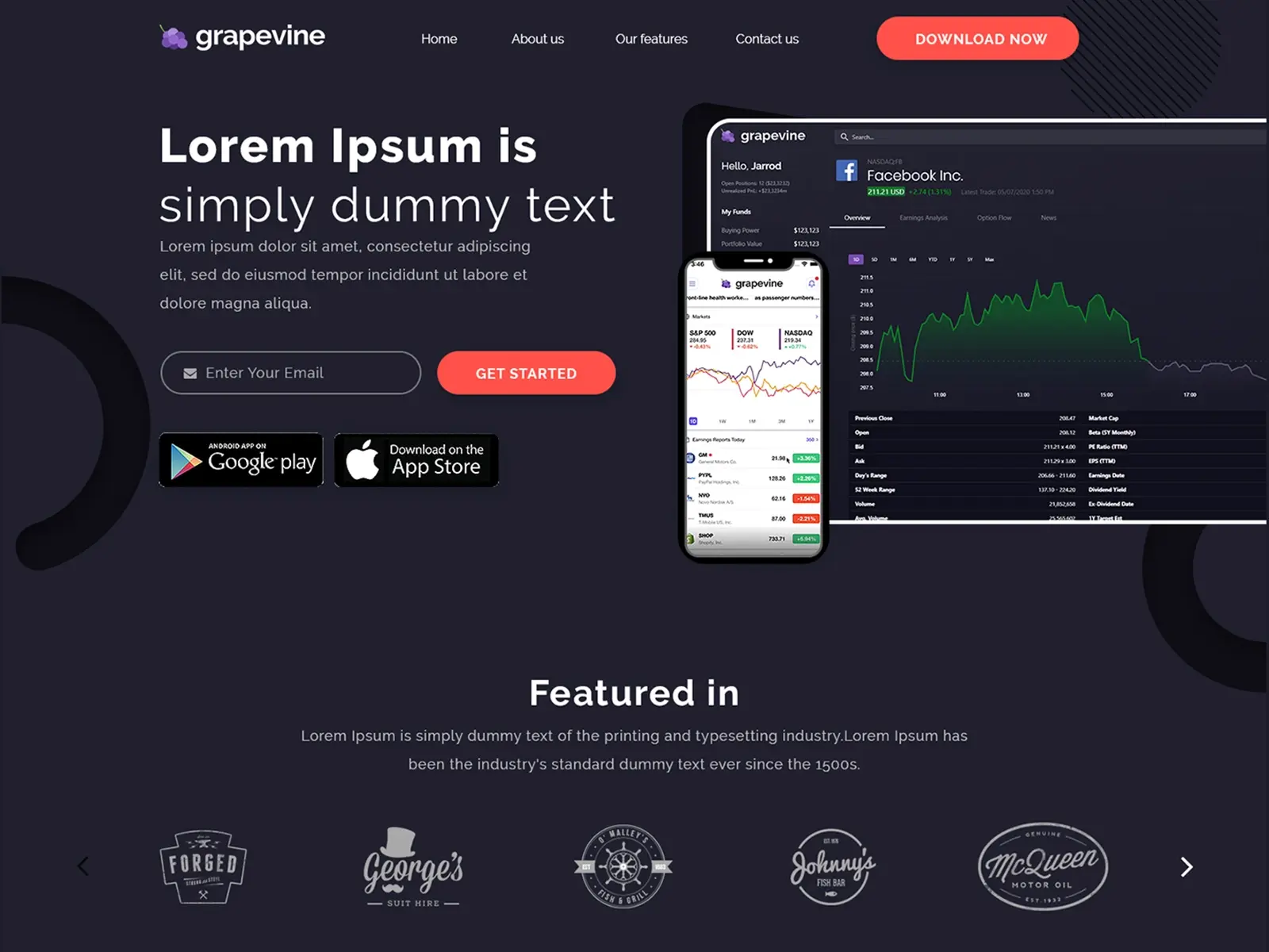
A modern, dark-themed SaaS landing page designed for a data-driven financial platform, focusing on clarity, trust, and conversion through strong visual hierarchy and immersive dashboard visuals.
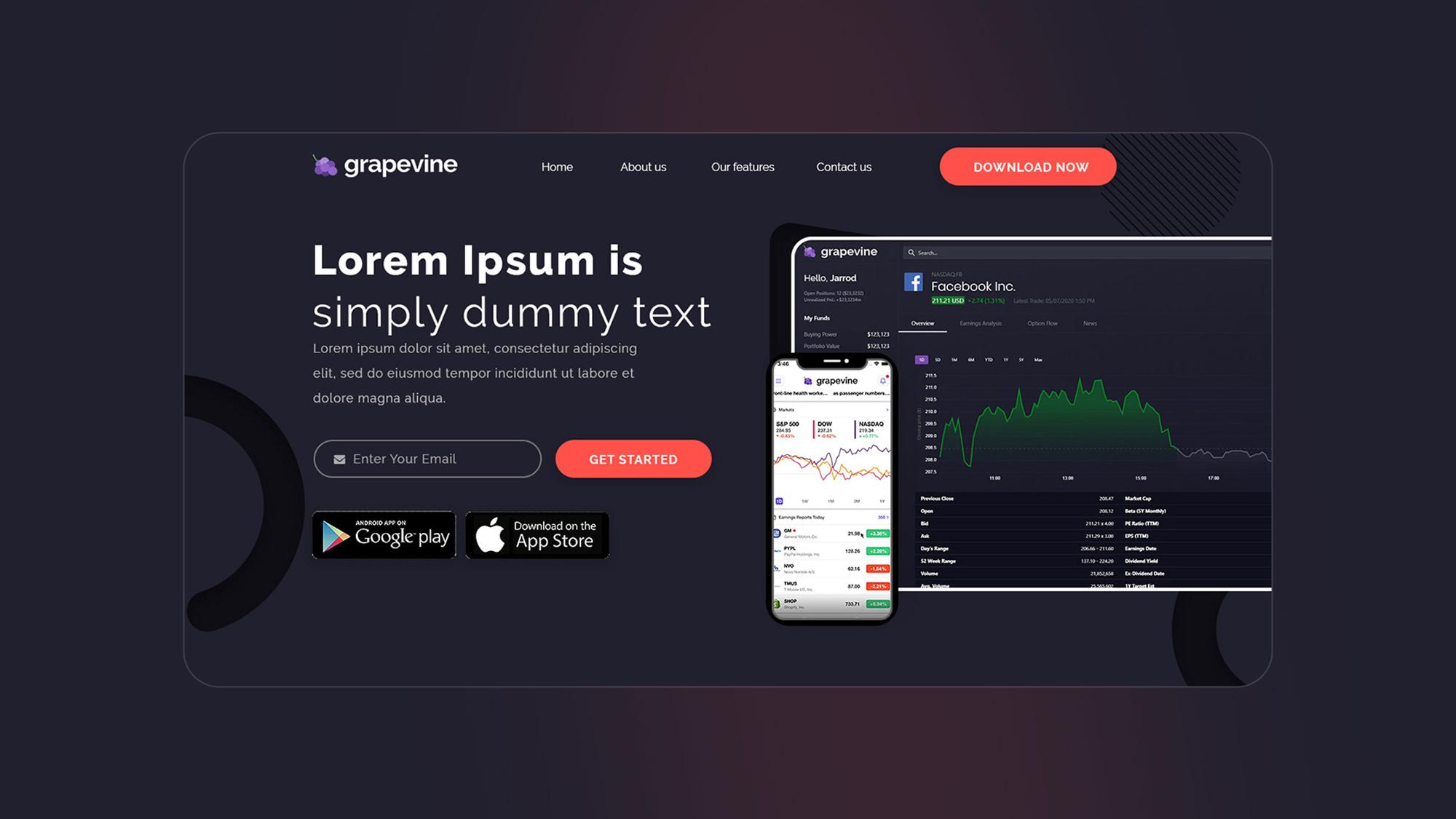
Balancing complex financial data with a clean and minimal design while ensuring the interface remains intuitive and user-friendly.
I designed a clean, structured layout with bold typography, clear sections, and dashboard-focused visuals to simplify information and guide users effectively.
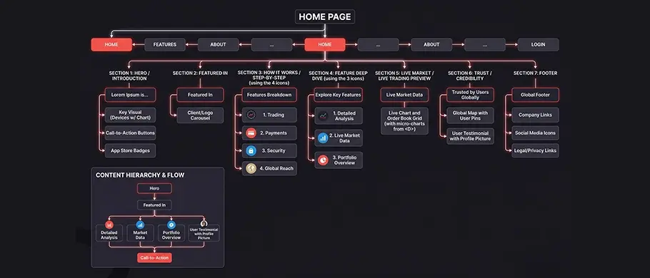
User flow visualization showing the primary path from onboarding to core task completion, ensuring minimal friction and logical hierarchy.
Primary / Inter
Abc
Heading 1
Bold 32pt
Body Copy
Regular 16pt / Line-height 1.6
#21202e
#ff514a
#ffffff
Created a dashboard-inspired layout to visually communicate complex financial data in an intuitive way.
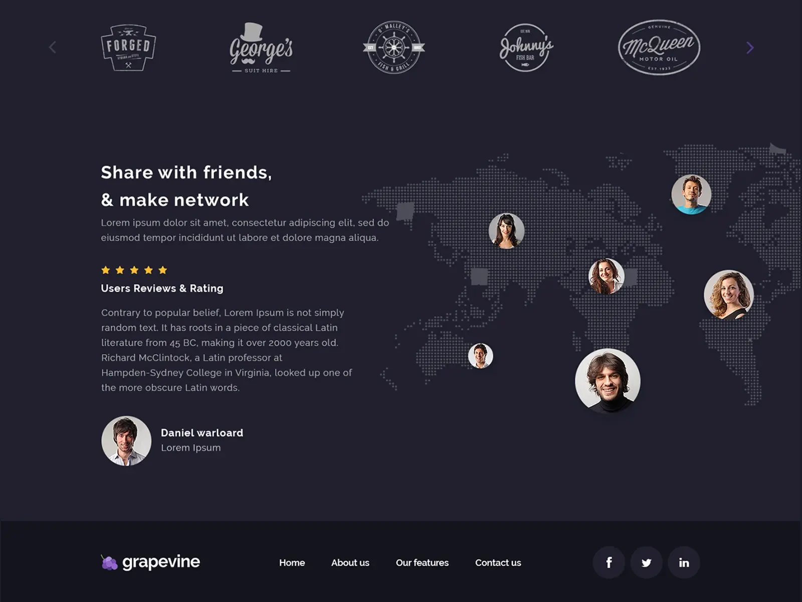
Structured the page to guide users from awareness to action with clear CTAs and logical content flow.
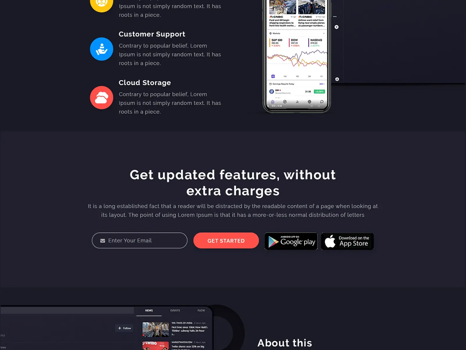
Used dark UI with subtle gradients and glow effects to create a premium and tech-forward look.
Experience the flow firsthand through this interactive prototype focusing on micro-interactions and seamless transitions.
Breaking down complex financial information into digestible UI components improves usability significantly.
Strong visual hierarchy ensures users can quickly scan and understand key information.
Following proven SaaS UI patterns helps improve familiarity and user trust.
Next Case Study
UI / UX Design